
Red Edge Brand Design

OFFICE BRANDING

Housing Cooperative Society

Creating a Consistent Branded Environment

Translating the organisation's identity into a professional and consistent branded office environment.

PROJECT OVERVIEW

Bringing the brand
into the workplace.

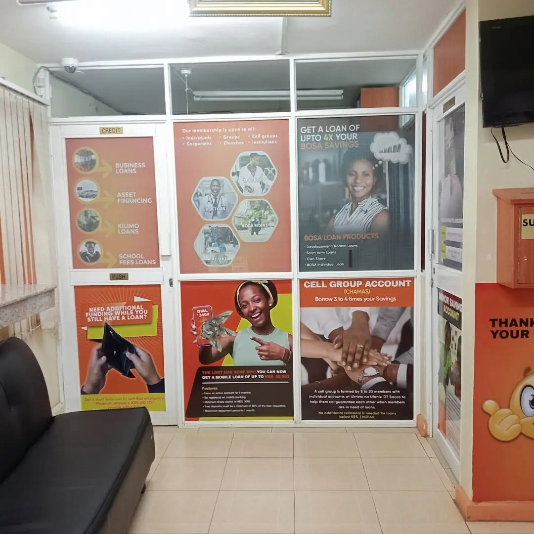
Red Edge Brand Design translated Housing Cooperative Society's identity into a professional office environment, creating branded spaces that reinforce the organisation's presence.

CLIENT Housing Cooperative Society
DISCIPLINE Office Branding
PROJECT Brand Execution
THE CHALLENGE

Making the workplace
part of the brand.

An organisation's physical environment is an important part of how its brand is experienced. The challenge was to carry the visual identity into the office in a way that felt clear, professional and consistent.

THE SOLUTION

Turning office space
into a brand touchpoint.

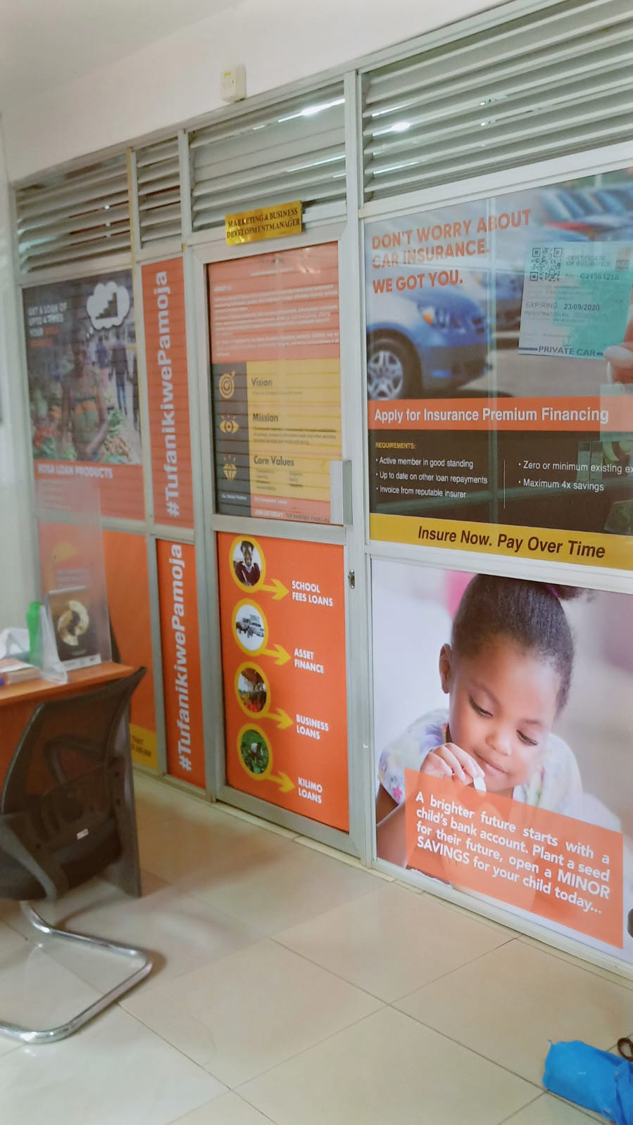
Red Edge applied the organisation's visual identity across the office environment, creating branded touchpoints that connect the physical space with the wider brand.

OFFICE BRANDING

The brand
in the workplace.

The office environment becomes an extension of the organisation's identity, creating a consistent visual experience for staff, members and visitors.

BRAND IN CONTEXT

A professional environment
that reflects the brand.

By carrying the visual identity into the physical environment, the office becomes part of the overall brand experience rather than simply a place of work.

THE RESULT

A more consistent
physical brand presence.

The branded office environment extends Housing Cooperative Society's identity beyond traditional communication materials and into the spaces where the organisation operates.