
Red Edge Brand Design

BRAND & PROMOTIONAL MATERIALS

Kenversity SACCO

A Consistent Brand Across Every Touchpoint

Developing branded and promotional materials that give Kenversity SACCO a clear, consistent and recognisable presence.

PROJECT OVERVIEW

A consistent brand
across every touchpoint.

Red Edge Brand Design developed branded and promotional materials for Kenversity SACCO, helping translate the organisation's visual identity into practical, customer-facing applications.

CLIENT Kenversity SACCO
DISCIPLINE Brand & Promotional Materials
PROJECT Brand Execution
THE CHALLENGE

Making the brand work
beyond the logo.

A strong brand needs to remain recognisable wherever customers encounter it. The project focused on extending Kenversity SACCO's identity into branded and promotional materials that could be used consistently in everyday communication.
THE SOLUTION

Turning the identity
into useful brand assets.

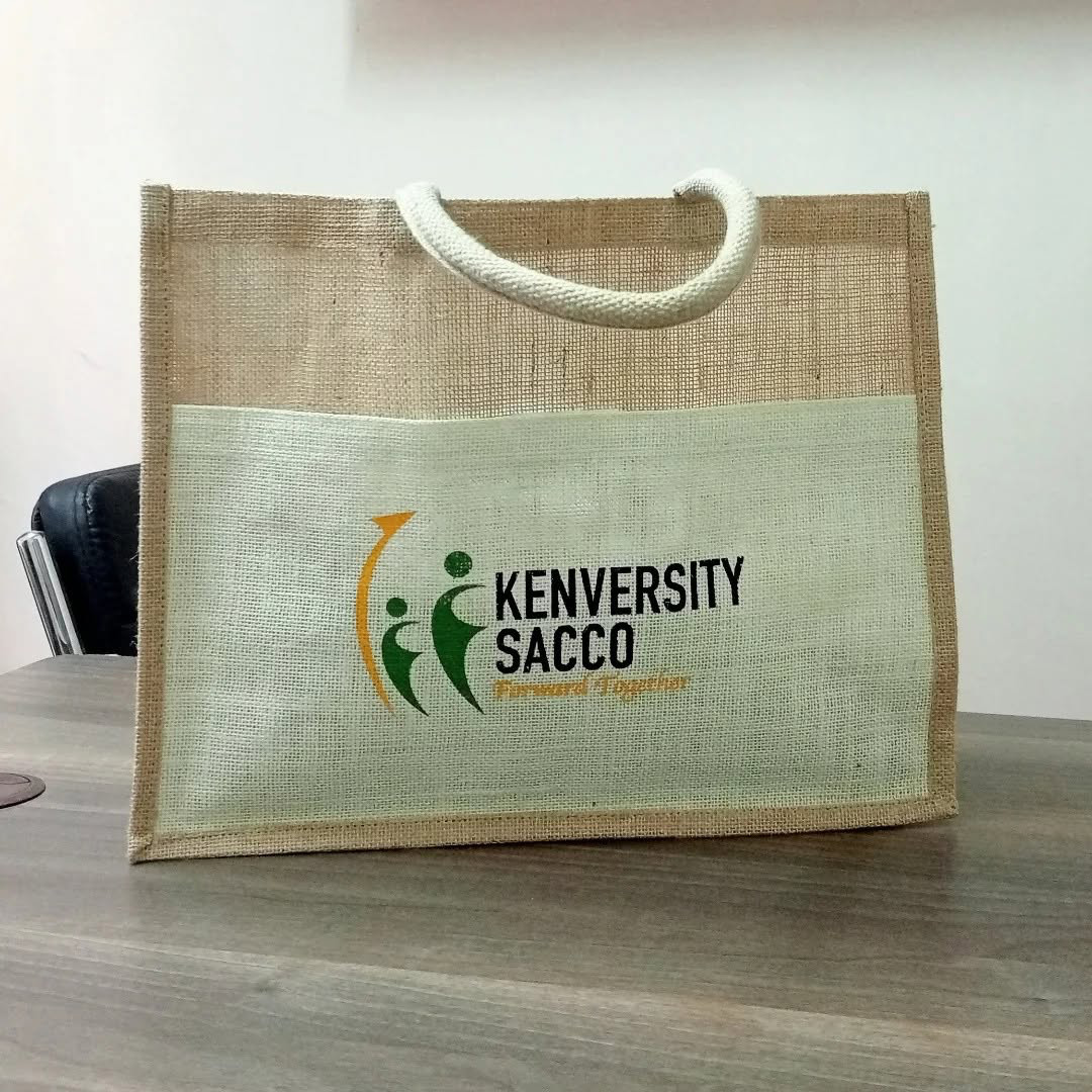
Red Edge translated the Kenversity SACCO identity into a range of promotional and branded materials, creating practical applications that maintain a consistent visual presence.

BRAND APPLICATIONS

The brand
in use.

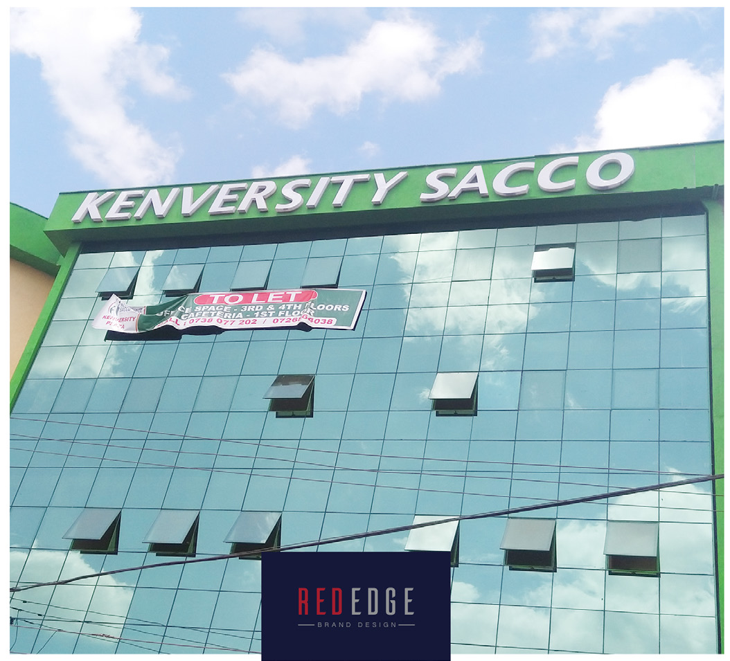
From promotional materials to physical brand assets, the identity was carried through into the materials customers and members interact with.

BRAND EXECUTION

Consistency that
carries the brand forward.

The result is a collection of branded materials that allows Kenversity SACCO to present a more consistent identity across its promotional activities and customer-facing communication.

THE RESULT

A brand that stays
recognisable wherever it appears.

Kenversity SACCO's identity was extended into practical branded and promotional applications, creating a more consistent experience across its physical touchpoints.