Red Edge Brand Design

BRAND IDENTITY & EXECUTION

African Savannah

A Distinctive Identity for a Travel Brand

Developing a distinctive brand identity and extending it across merchandise, promotional materials and branded environments.

PROJECT OVERVIEW

A distinctive identity
built to travel.

Red Edge Brand Design developed a new visual identity for African Savannah Connections and extended the brand across a range of physical and promotional touchpoints.

CLIENT African Savannah Connections
DISCIPLINE Brand Identity & Execution
APPLICATIONS Merchandise, Display & Promotional Materials
THE CHALLENGE

Creating a brand identity
with a clear sense of place.

African Savannah Connections needed an identity that could communicate its character clearly and translate naturally across the many physical touchpoints used to represent the brand.

THE SOLUTION

A confident visual identity designed for real-world use.

The new identity combines a strong wordmark with a distinctive graphic element and a flexible colour system. The result was developed to work across merchandise, promotional materials and branded environments.

THE IDENTITY

African Savannah
Connections.

African Savannah Connections logo and brand identity
MERCHANDISE

Bringing the identity
into people's hands.

The identity was translated into practical branded merchandise, creating consistent and recognisable touchpoints beyond traditional corporate materials.

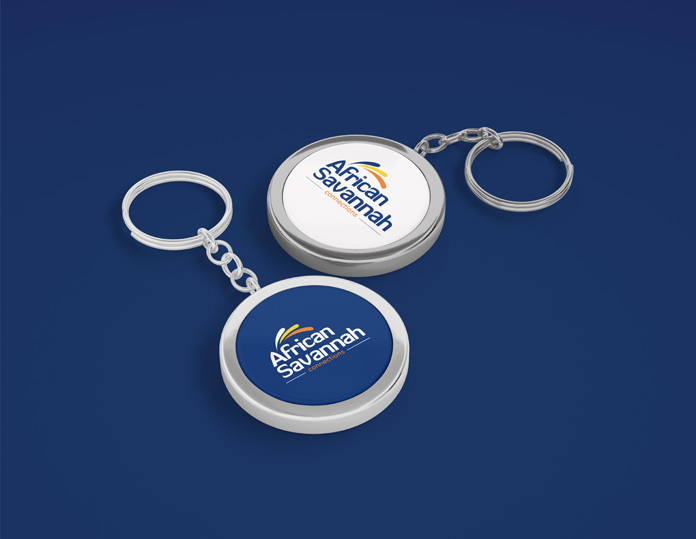
African Savannah branded keyrings
African Savannah branded mugs
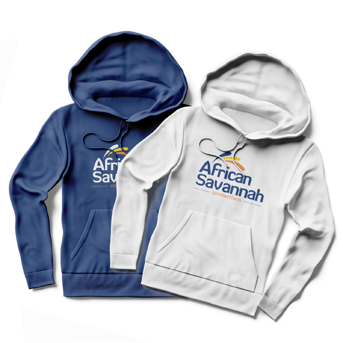
African Savannah branded hoodies
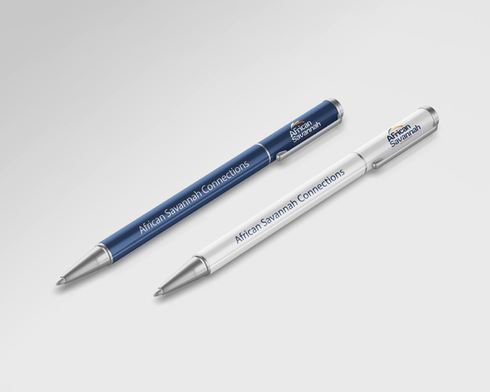
African Savannah branded pens
BRAND ENVIRONMENT

A visual identity
made to stand out.

The branding was extended into display and exhibition environments, giving the organisation a consistent visual presence when interacting with its audience.

African Savannah Connections branded display
BRAND IN USE

Consistency across
every touchpoint.

African Savannah Connections brand applications
THE RESULT

One identity.
A complete brand experience.

The African Savannah Connections identity was translated into a flexible system of branded materials and physical applications, creating a consistent presence across customer-facing touchpoints.