
A Distinctive Identity
for a Modern Tour Brand
Red Edge Brand Design was commissioned to strategically rebrand an established and ambitious tour consultancy looking to strengthen its presence in a competitive market.
The goal was to create an identity that felt distinctive, confident and contemporary rather than falling into the predictable visual language common within the sector.
Standing Apart
in a Crowded Market
The brief called for an identity capable of differentiating the consultancy from the many tourism and travel brands using repetitive and predictable visual approaches.
Rather than relying on familiar travel clichés, the rebrand focused on developing a more ownable and recognisable visual identity.
Building a Complete
Brand System
Corporate Identity
A cohesive identity system designed to give the consultancy a stronger and more recognisable presence.
Logo & Icon Design
A distinctive logo and supporting visual elements developed to establish a clear brand signature.
Brand Applications
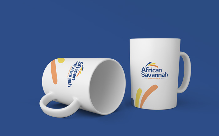
The identity was extended into stationery, signage, vehicle branding, digital and merchandising applications.
Designed to be
recognised.
A visual identity created to move the brand beyond generic travel aesthetics and establish a stronger point of distinction.
Corporate Identity