Evolving the brand
without losing its identity.
NSSF SACCO needed a visual presence that felt more contemporary and relevant while continuing to represent an established and trusted organisation.

Red Edge Brand Design refreshed the NSSF SACCO identity to create a more contemporary, stylish and appealing brand presence while maintaining the familiarity of an established institution.
NSSF SACCO needed a visual presence that felt more contemporary and relevant while continuing to represent an established and trusted organisation.
The refreshed identity introduced a more contemporary visual direction and was developed to work consistently across the different environments in which NSSF SACCO communicates with its audience.
The refreshed identity was carried through the brand's physical communication materials and customer-facing environments.



Following the refresh, the new identity was implemented across billboards nationally and in different parts of the city.

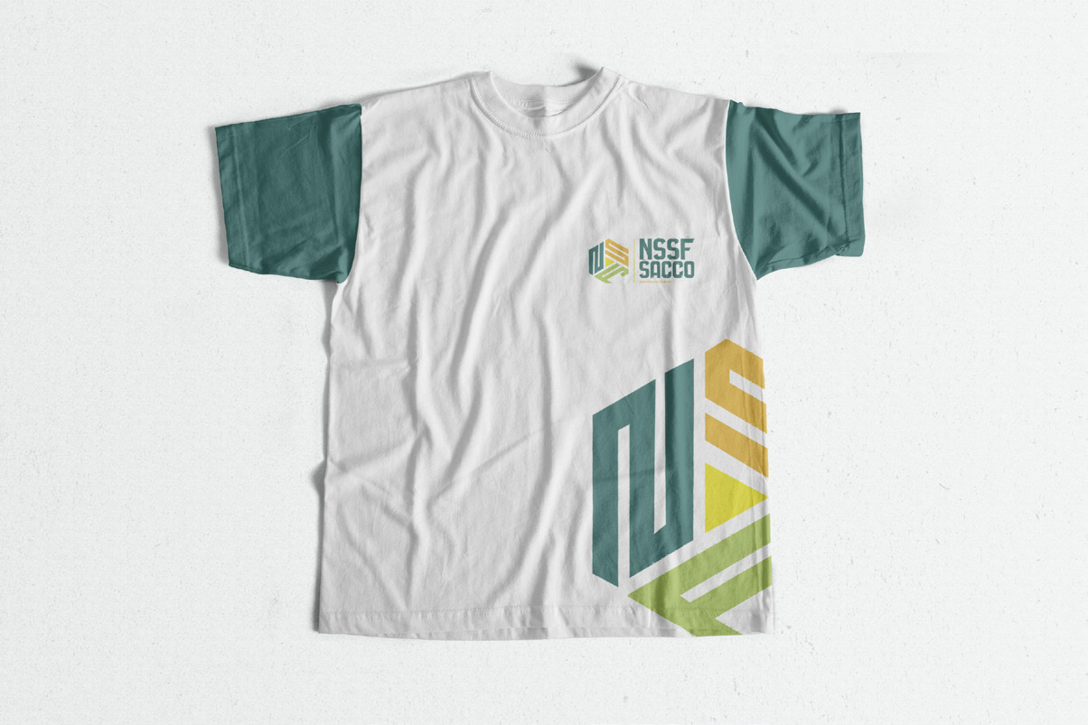
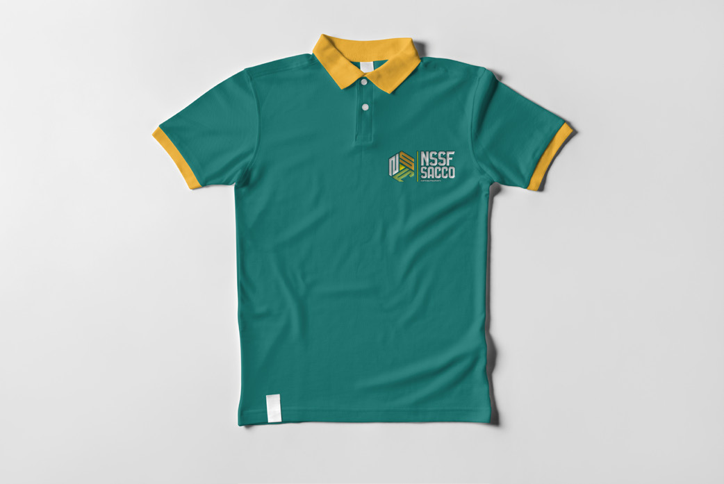
The refreshed identity gave NSSF SACCO a stronger visual presence and extended the new brand direction across prominent customer-facing applications.